ShopDreamUp AI ArtDreamUp

Deviation Actions


Suggested Deviants


Suggested Collections


You Might Like…
![Goodbye... - [Hawkwing's Journey SPOILERS!]](https://images-wixmp-ed30a86b8c4ca887773594c2.wixmp.com/f/81dc9344-2f59-4745-8b6c-b342a6d3dcb1/db2ufmz-b85e6985-c5f5-427e-9138-f315e07d0e0e.png/v1/crop/w_184,h_184,x_36,y_0,scl_0.17037037037037,q_70,strp/goodbye_______hawkwing_s_journey_spoilers___by_scourgiez_db2ufmz-92s-2x.jpg?token=eyJ0eXAiOiJKV1QiLCJhbGciOiJIUzI1NiJ9.eyJzdWIiOiJ1cm46YXBwOjdlMGQxODg5ODIyNjQzNzNhNWYwZDQxNWVhMGQyNmUwIiwiaXNzIjoidXJuOmFwcDo3ZTBkMTg4OTgyMjY0MzczYTVmMGQ0MTVlYTBkMjZlMCIsIm9iaiI6W1t7ImhlaWdodCI6Ijw9NTc2IiwicGF0aCI6IlwvZlwvODFkYzkzNDQtMmY1OS00NzQ1LThiNmMtYjM0MmE2ZDNkY2IxXC9kYjJ1Zm16LWI4NWU2OTg1LWM1ZjUtNDI3ZS05MTM4LWYzMTVlMDdkMGUwZS5wbmciLCJ3aWR0aCI6Ijw9MTAyNCJ9XV0sImF1ZCI6WyJ1cm46c2VydmljZTppbWFnZS5vcGVyYXRpb25zIl19.WqE3MvbVF8KIwVF81Ckj6n0_YboJp64qtInLaJ_ZaSI)
![Goodbye... - [Hawkwing's Journey SPOILERS!]](https://images-wixmp-ed30a86b8c4ca887773594c2.wixmp.com/f/81dc9344-2f59-4745-8b6c-b342a6d3dcb1/db2ufmz-b85e6985-c5f5-427e-9138-f315e07d0e0e.png/v1/crop/w_92,h_92,x_18,y_0,scl_0.085185185185185,q_70,strp/goodbye_______hawkwing_s_journey_spoilers___by_scourgiez_db2ufmz-92s.jpg?token=eyJ0eXAiOiJKV1QiLCJhbGciOiJIUzI1NiJ9.eyJzdWIiOiJ1cm46YXBwOjdlMGQxODg5ODIyNjQzNzNhNWYwZDQxNWVhMGQyNmUwIiwiaXNzIjoidXJuOmFwcDo3ZTBkMTg4OTgyMjY0MzczYTVmMGQ0MTVlYTBkMjZlMCIsIm9iaiI6W1t7ImhlaWdodCI6Ijw9NTc2IiwicGF0aCI6IlwvZlwvODFkYzkzNDQtMmY1OS00NzQ1LThiNmMtYjM0MmE2ZDNkY2IxXC9kYjJ1Zm16LWI4NWU2OTg1LWM1ZjUtNDI3ZS05MTM4LWYzMTVlMDdkMGUwZS5wbmciLCJ3aWR0aCI6Ijw9MTAyNCJ9XV0sImF1ZCI6WyJ1cm46c2VydmljZTppbWFnZS5vcGVyYXRpb25zIl19.WqE3MvbVF8KIwVF81Ckj6n0_YboJp64qtInLaJ_ZaSI)


Featured in Groups


Description
I just can't look.. it's killing me..
and taking control.
Jealousy..
Turning saints into the sea
Swimming through sick lullabies
Choking on your alibis
But it's just the price I pay
Destiny is calling me
Open up my eager eyes...
Cause I'm Mr Brightside.
I never...
This fake screenshot was complete inspired by this beautiful video [link] <3
Please, please, please, please don't yell at me. I don't know anything about the Warriors series. XD
Therefore...
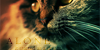
The close-up cat is Ashfur, and the other two are Squirrelflight and Brambleclaw. c:
All I know is that he died.
Enough said, I don't want total Warrior-know-it-alls to go all turbo on me. :U
Worked on this here and there throughout the day, I'd say around 5-6 hours in all. ouo
I had to draw a little something for my animal artists; you guys haven't seen anything since JUNE. LOL.
If you don't know what the subtitle means, try and process it one more time. |D
art (c) me
Ashfur+cats (c) Erin Hunter
Mister Brightside - The Killers
and taking control.
Jealousy..
Turning saints into the sea
Swimming through sick lullabies
Choking on your alibis
But it's just the price I pay
Destiny is calling me
Open up my eager eyes...
Cause I'm Mr Brightside.
I never...
This fake screenshot was complete inspired by this beautiful video [link] <3
Please, please, please, please don't yell at me. I don't know anything about the Warriors series. XD
Therefore...
The close-up cat is Ashfur, and the other two are Squirrelflight and Brambleclaw. c:
All I know is that he died.
Enough said, I don't want total Warrior-know-it-alls to go all turbo on me. :U
Worked on this here and there throughout the day, I'd say around 5-6 hours in all. ouo
I had to draw a little something for my animal artists; you guys haven't seen anything since JUNE. LOL.
If you don't know what the subtitle means, try and process it one more time. |D
art (c) me
Ashfur+cats (c) Erin Hunter
Mister Brightside - The Killers
Image size
1905x1300px 1.37 MB
© 2013 - 2024 wolfiisaur
Comments43
Join the community to add your comment. Already a deviant? Log In
This is very good!
I'll deliver what could be fixed first, then some of the things that are amazing after.
The renderment of the cats' bodies are very good. The few things I'd recoment being fixed would be that you make the elbow of the cat hugging the other, wider. The tail of the cat leaning against the other should either have more dimention added to it, or it could be laying sideways to the right, the opposite way the cat is leaning towards. It's just a more natural position. The last thing would be that the cat closest to us should have his head just a BIT more connected to his shoulders, meaning you could probably fill the rest of that gap on the left side underneith his chin, with fur. This would just show that he's slouching a bit better, and would again, connect his head to his shoulders a bit more realisticly in the position that he's in.
Now, for the comments on things that pop!
This is REALLY good, even with the character's colorations, due to the fact that you've not read the books!
The bodies' proportions are perfect, the grass matches the style of the drawing, the moonlight looks INCREDIBLE! The shine makes is look as though we're looking through a camera, which adds to the fact that this is a fake TV show screenshot! The text again, adds to it looking like subtitles, which is great! The shadows and highlights are really great, and are smoothly transitioned so that they look very natural.
You've done an AMAZING job with this piece! I hope you find my critique helpful!
Great work!
~Silverfang98